Design, Social Media
Fresh & Foraged
Branding, social media content, campaign development, copywriting, layout design
Client: Fresh & Foraged Cafe
Programs: Adobe Illustrator, Canva, CapCut
Problem: New business owners of the quaint gluten-free cafe in Spokane, Washington are in need of a solid, consistent brand with a strong social media presence in the midst of business modifications like menu expansion and process changes to maintain current customer loyalty while building brand awareness and bringing in new faces.
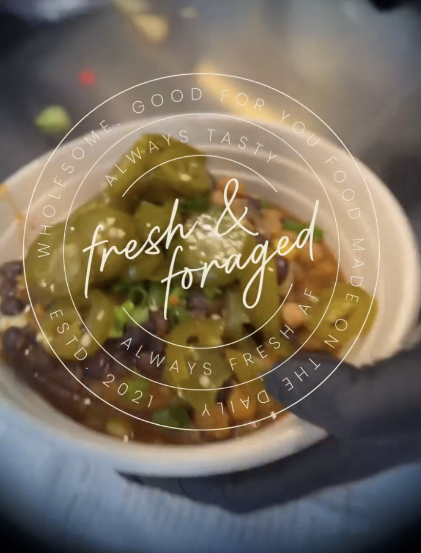
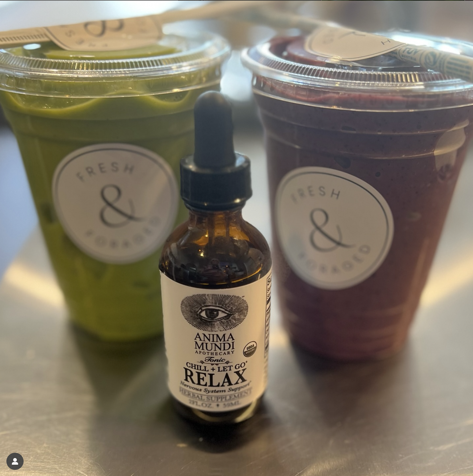
Solution: Develop a solid, consistent brand with a simple selection of colors, typography, design choices and the use of one logo to create brand consistency and trust. Use this brand across multiple mediums for advertisement including social media content creation, digital and print menus, stickers, flyers and coupons.

Fresh & Foraged Cafe Before:


Although Fresh & Foraged uses high-quality ingredients and produces delicious gluten-free options for the greater Spokane area, they found themselves struggling as a business. Between shut-downs and several business owner changes in four years, their marketing was not an area they were able to spend time on. This resulted in inconsistent branding, making it hard for consumers to identify them as a business they can trust.
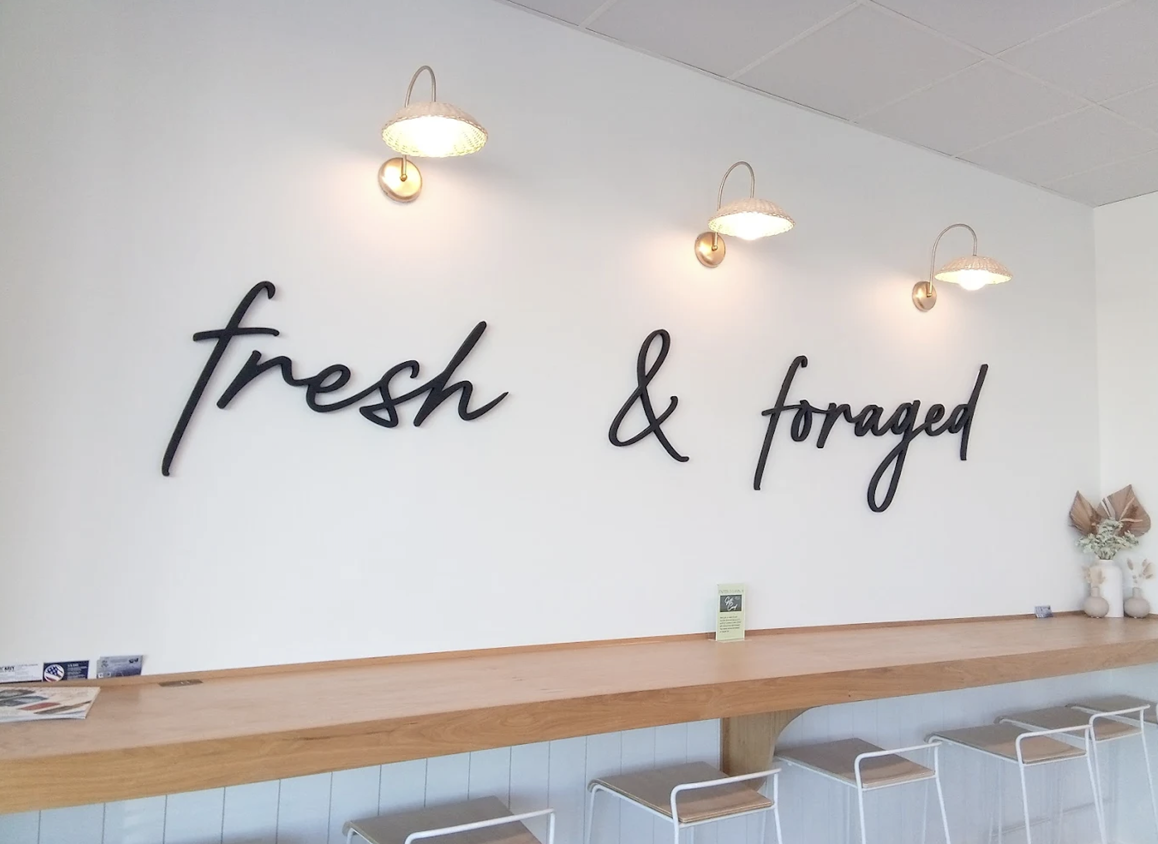
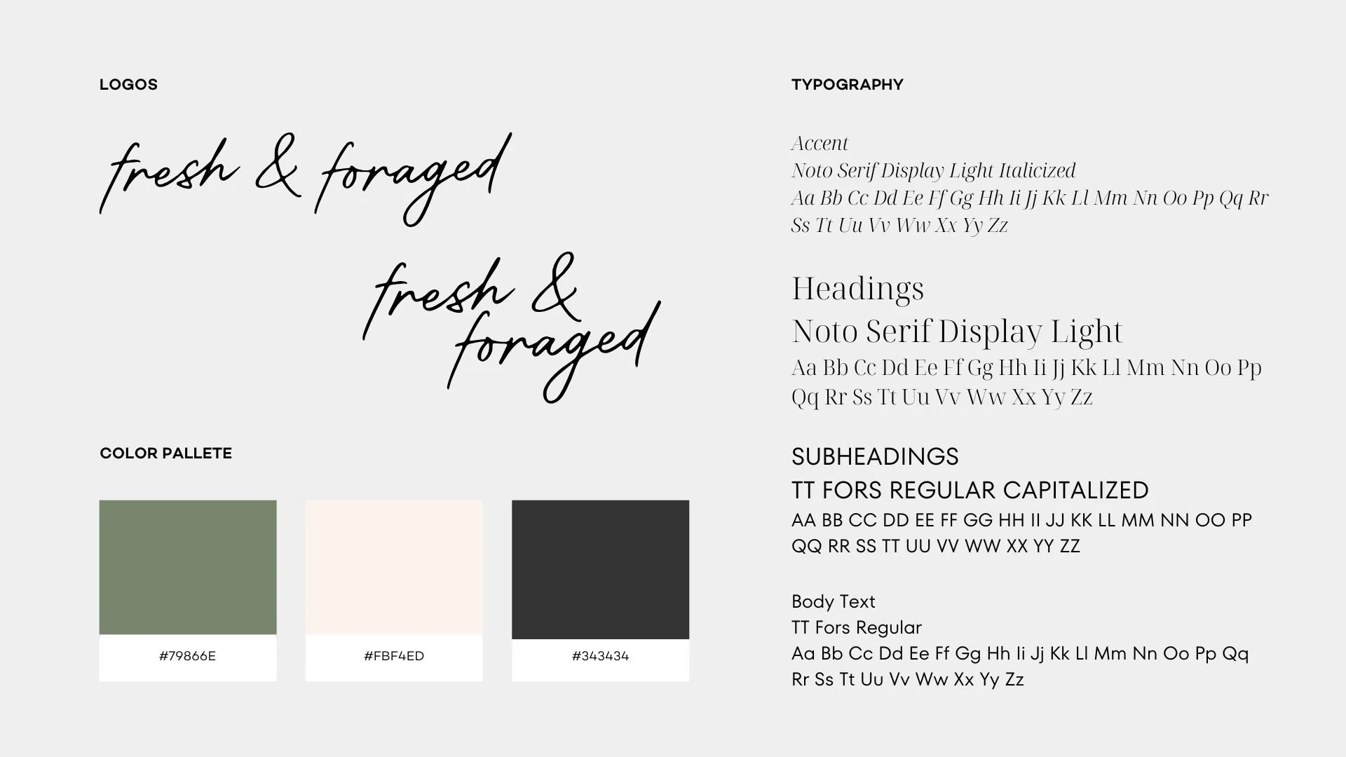
I chose to pick one of their several logos to work with, specifically the one on their storefront and street signage. Then, I developed a simple color palette and chose typography to use on all future design and marketing projects that they could easily understand and locate in Canva.
The Refreshed Brand
Then, it was time to implement the brand into a social media presence and strategy as they introduced new menu items and business operational changes.

Social Media Presence Before


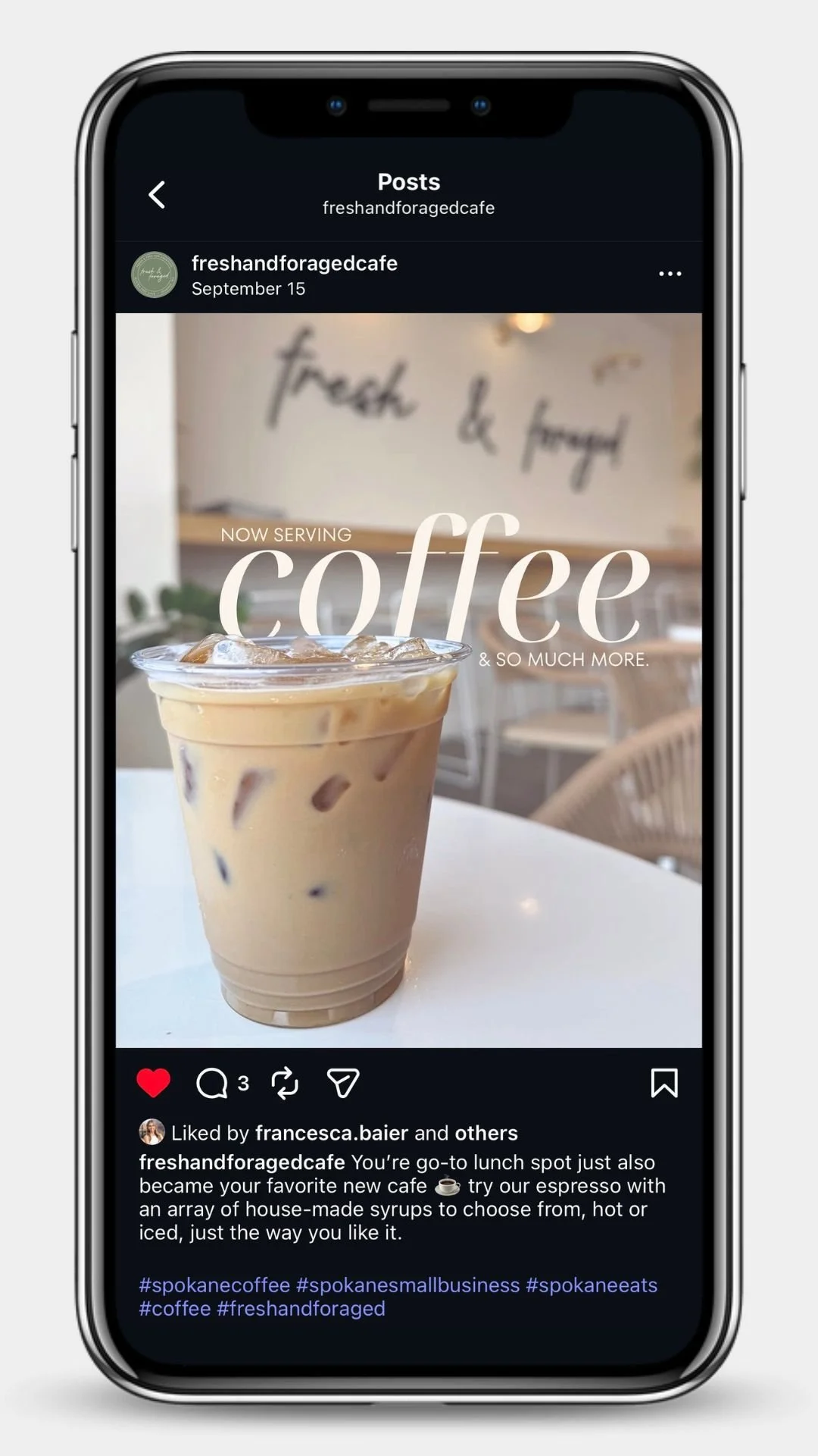
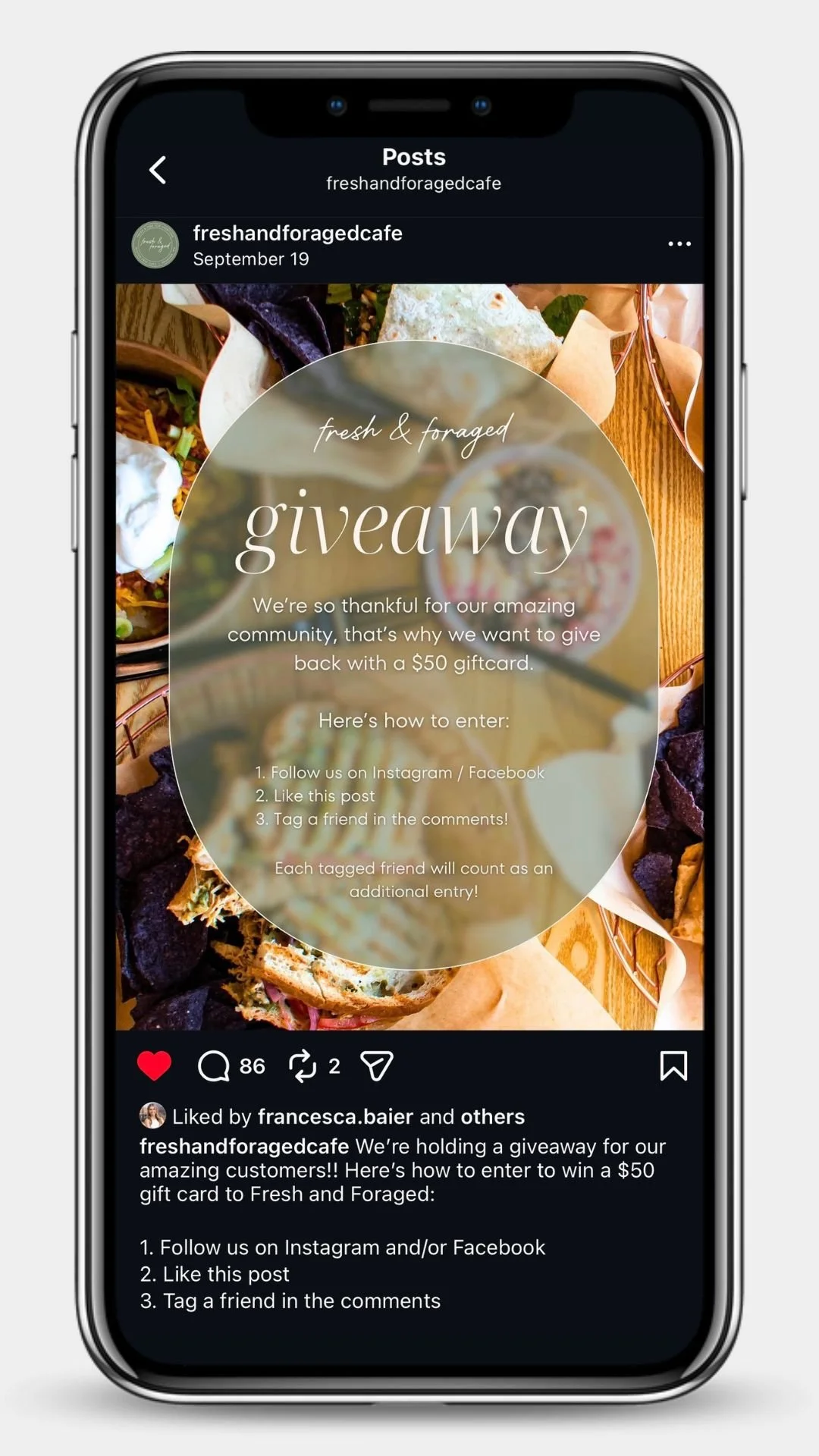
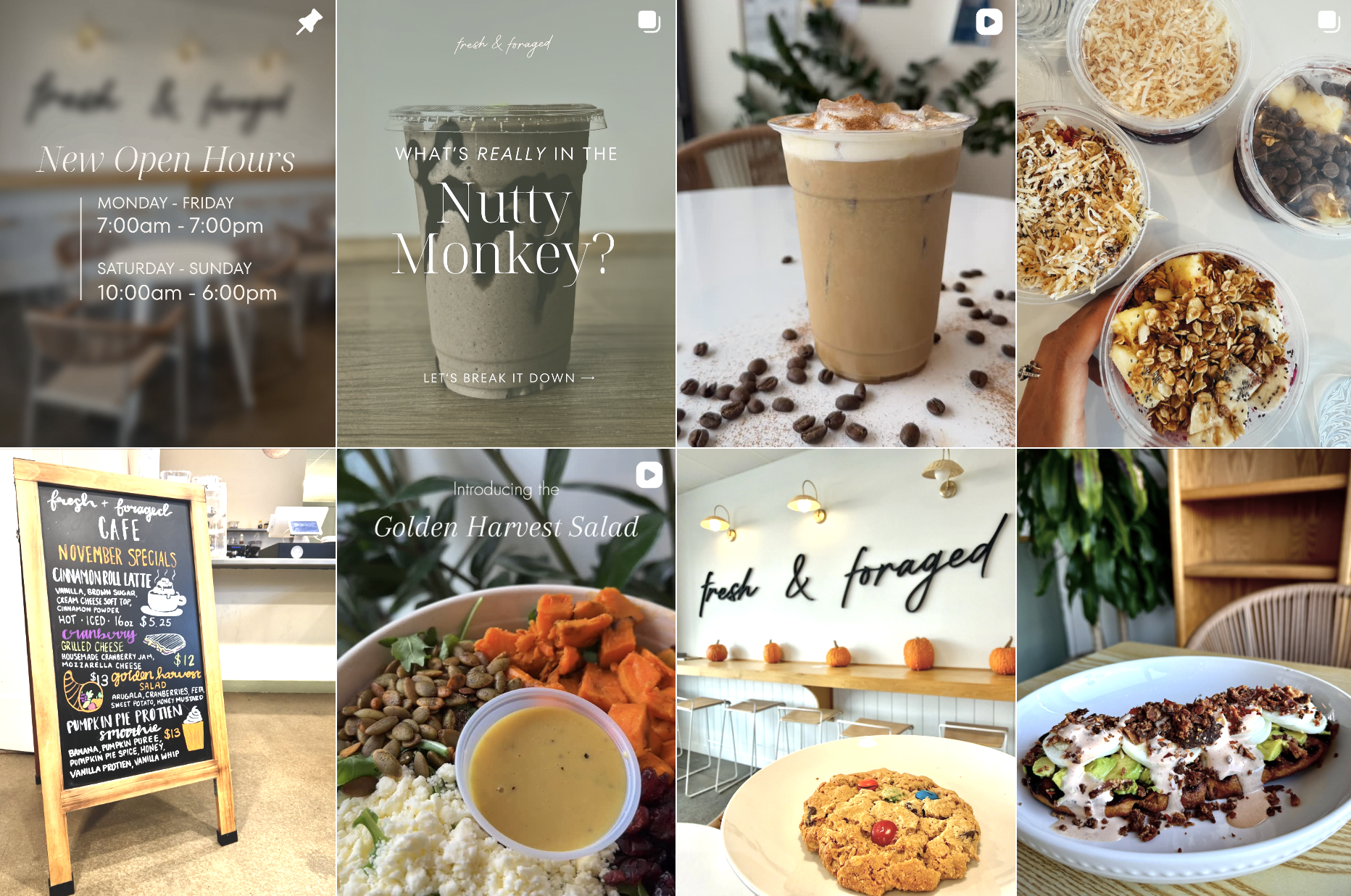
New Social Media Posts
with new applied, consistent branding.
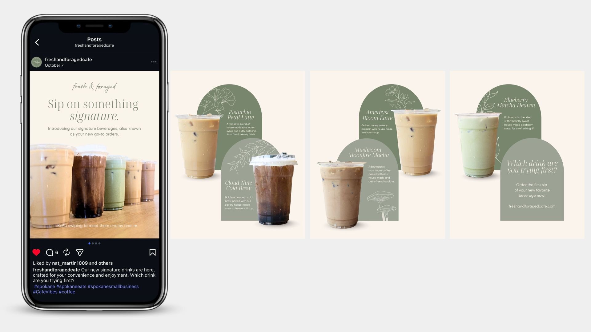
Signature Drink Menu Announcement

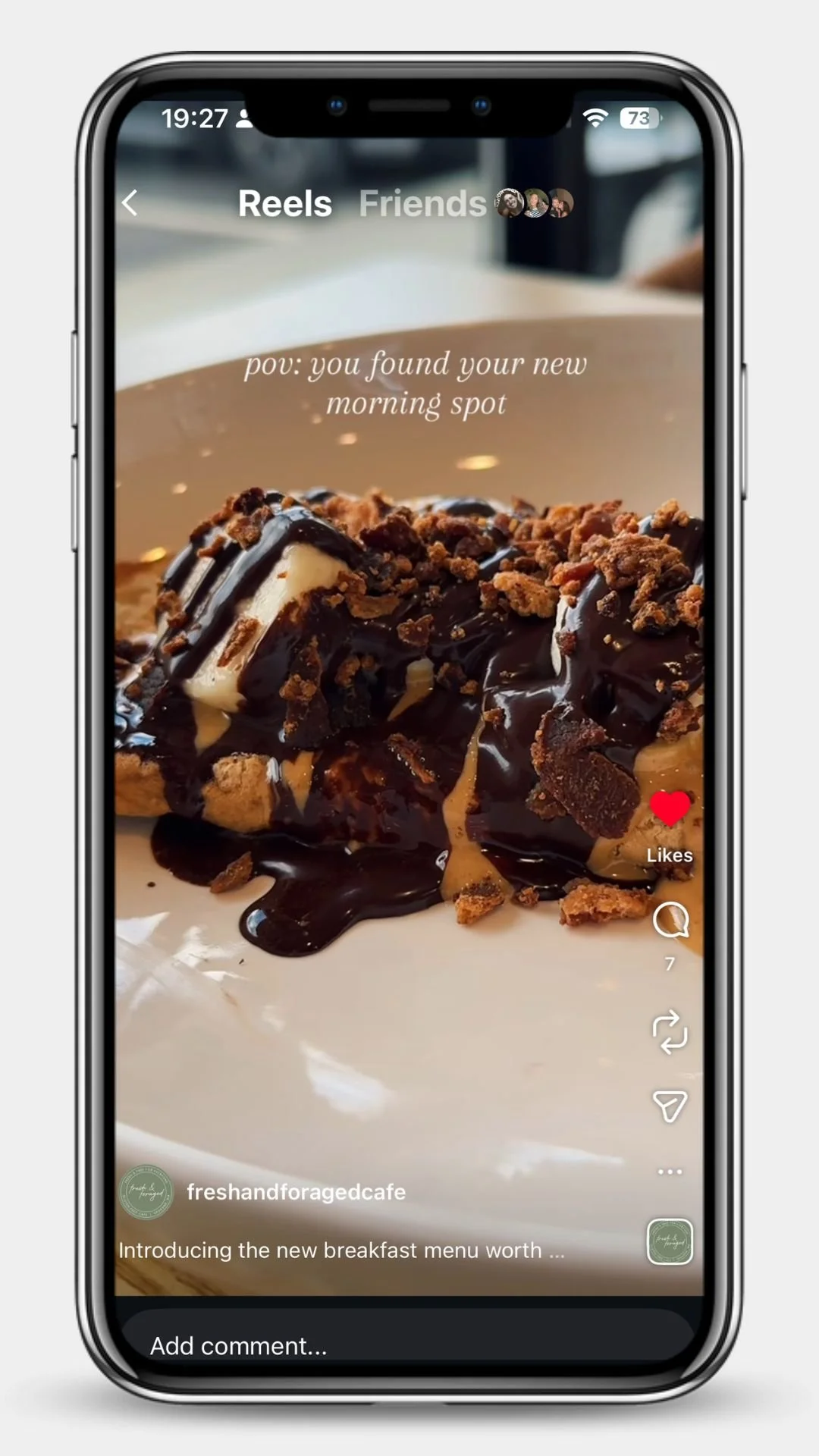
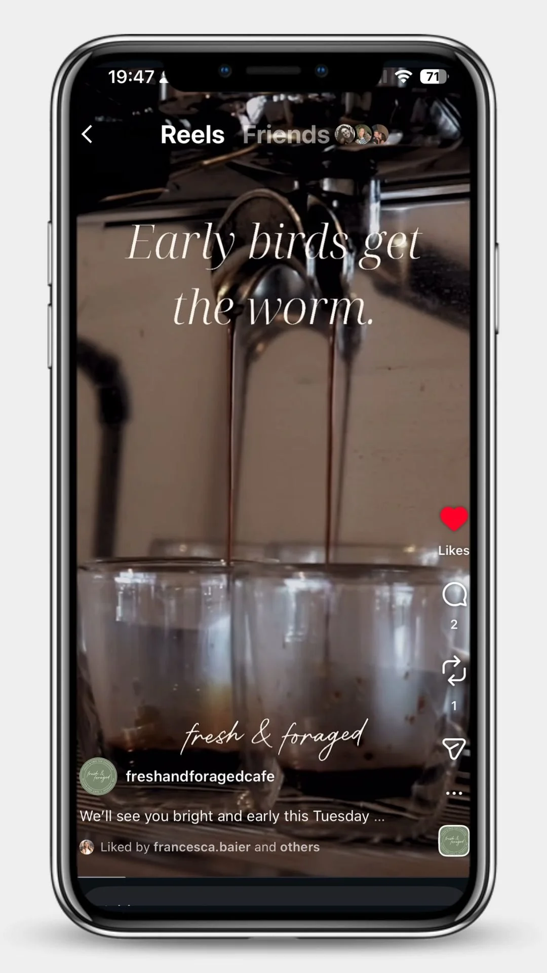
New Social Media Reels
Click to watch the associated reel.
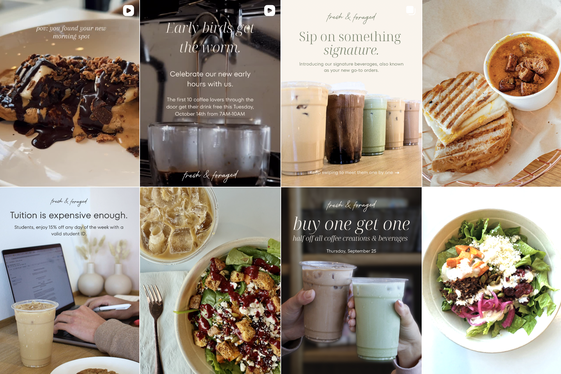
Social Media Presence After
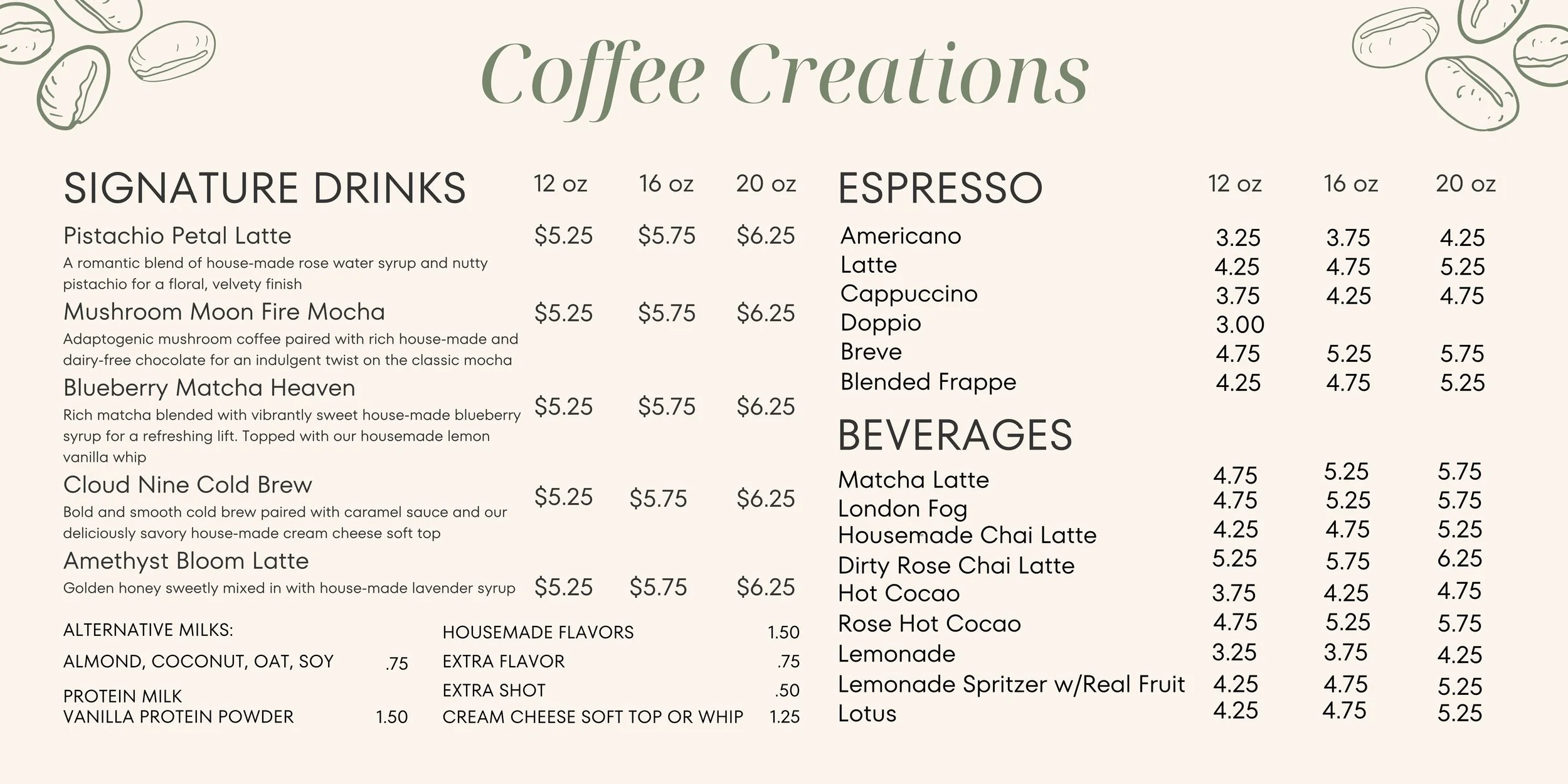
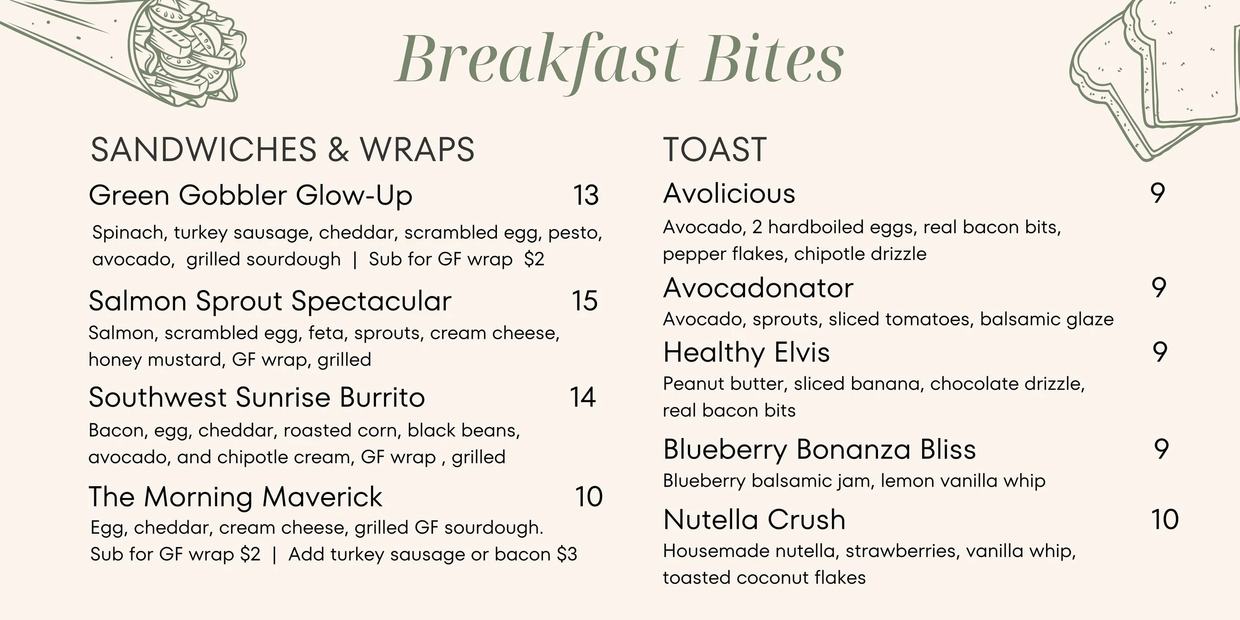
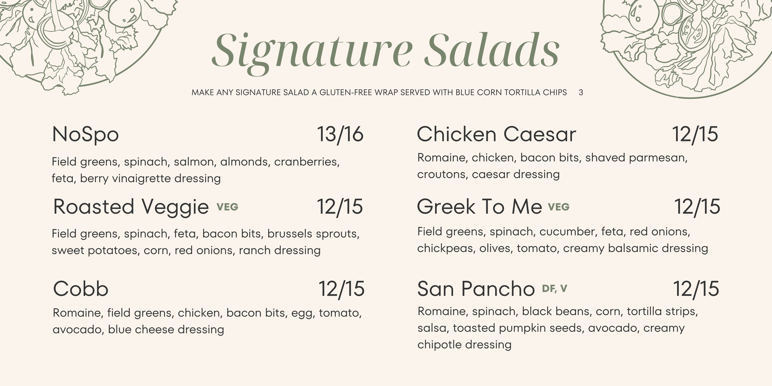
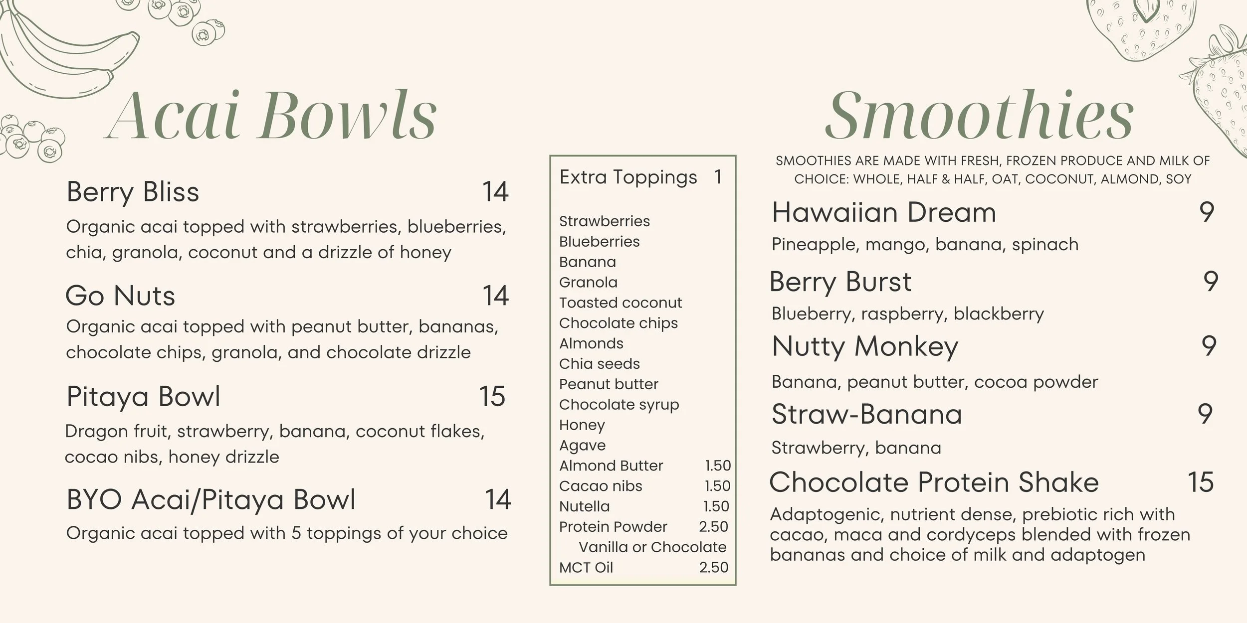
The next step was to improve their branding consistency within the store by redesigning their menus, both for TV screens and physical print menus as they expanded their menu to improve readability.
On-Screen Menus Before
Many customers struggled to absorb these menus and make decisions due to its lack of readability and cluttered design layout.

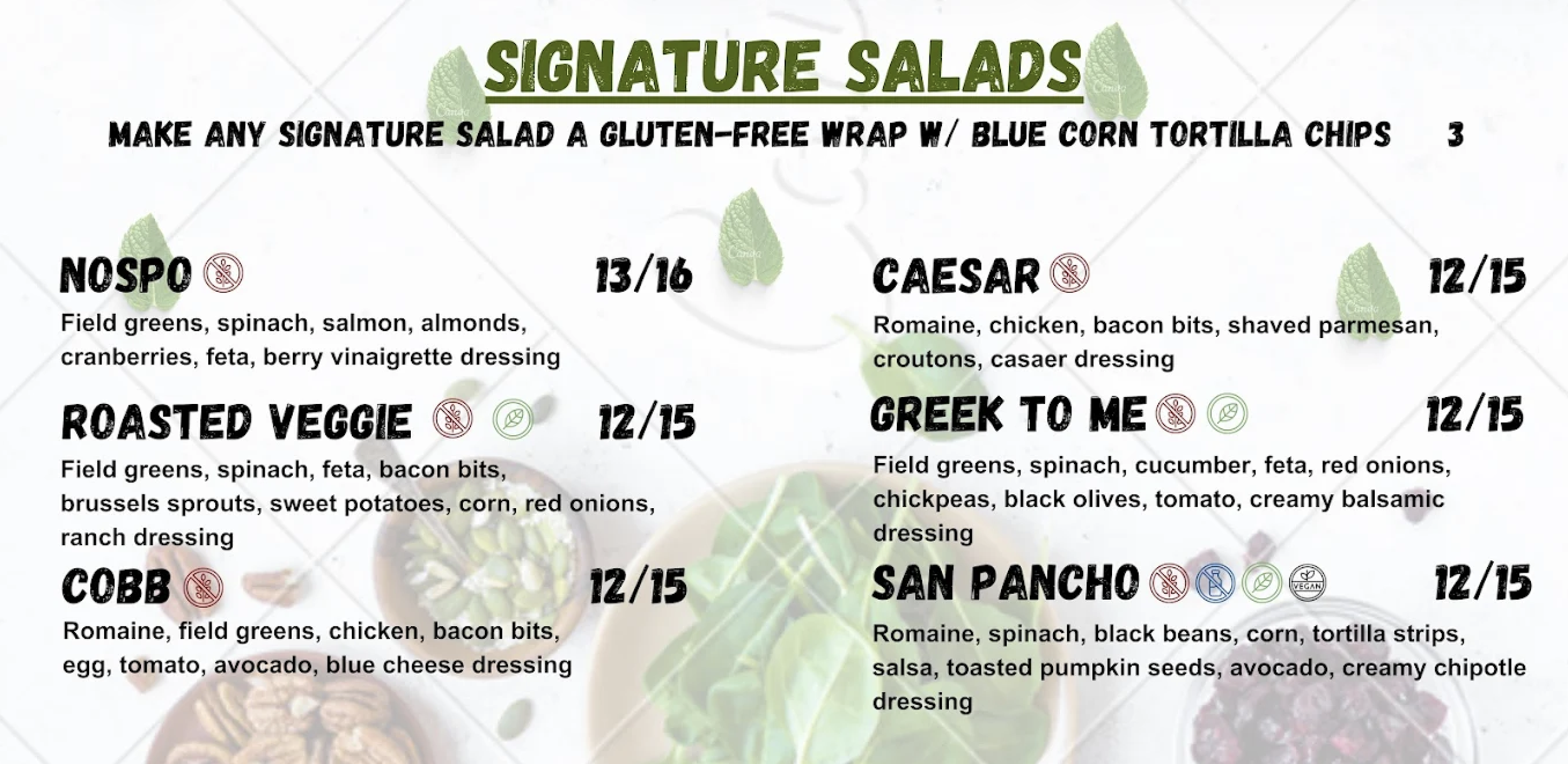

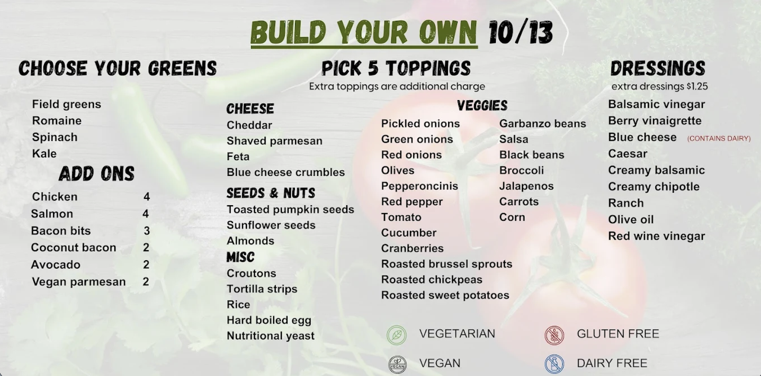
On-Screen Menus After
with new applied, consistent branding and layout techniques to improve absorbability and readability.
Implementing these menus resulted in many loyal customers realizing we had new items that had been on the menu for months at that point, proving the power of hierarchy and clean layout.
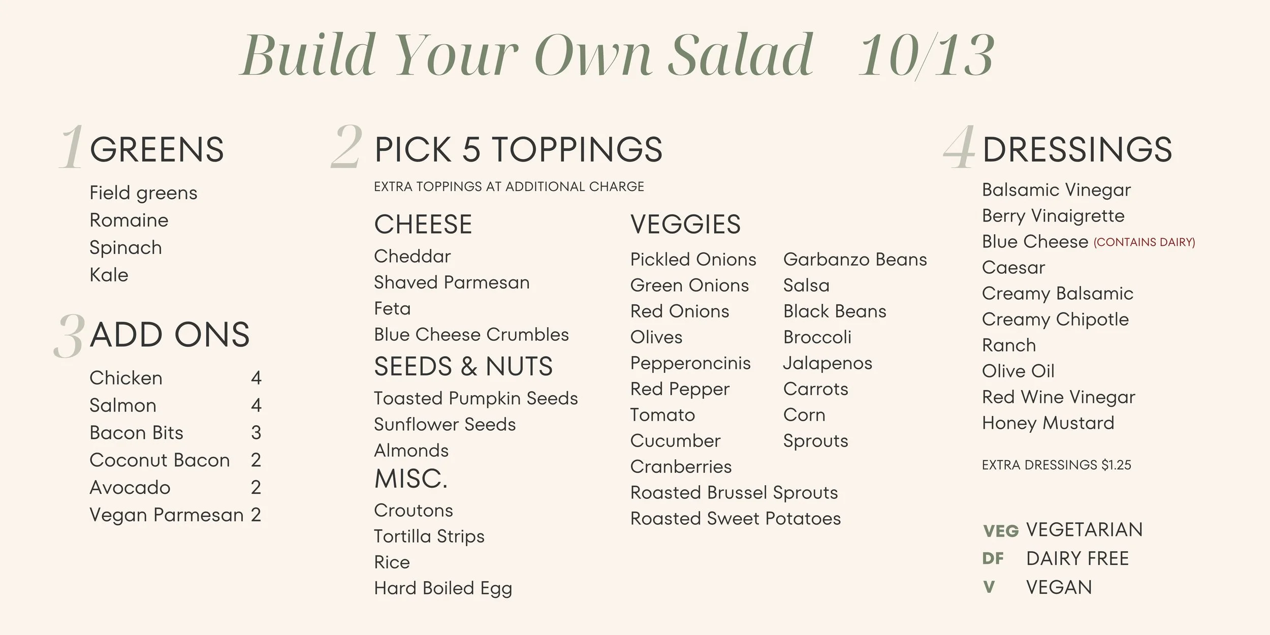

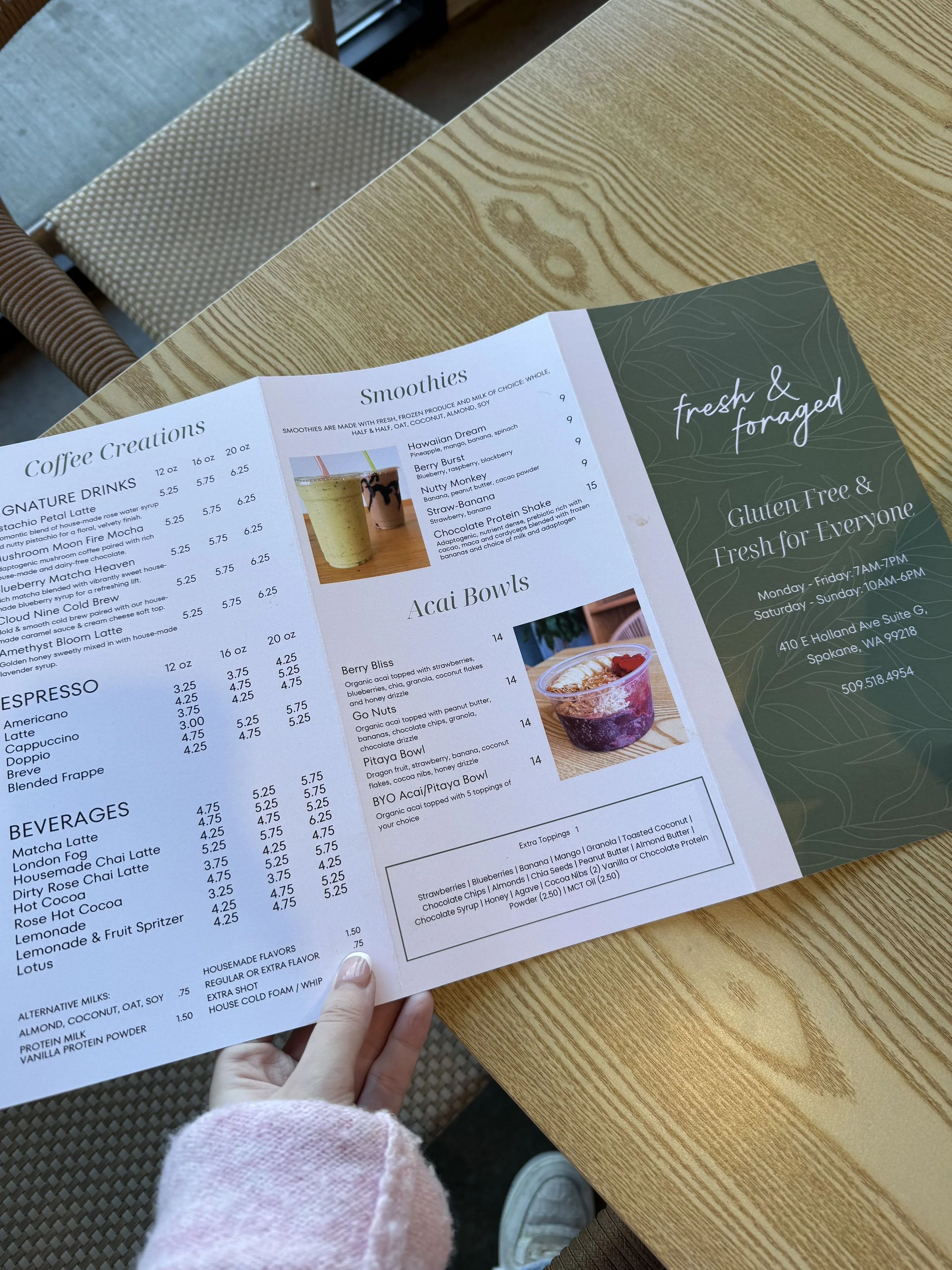
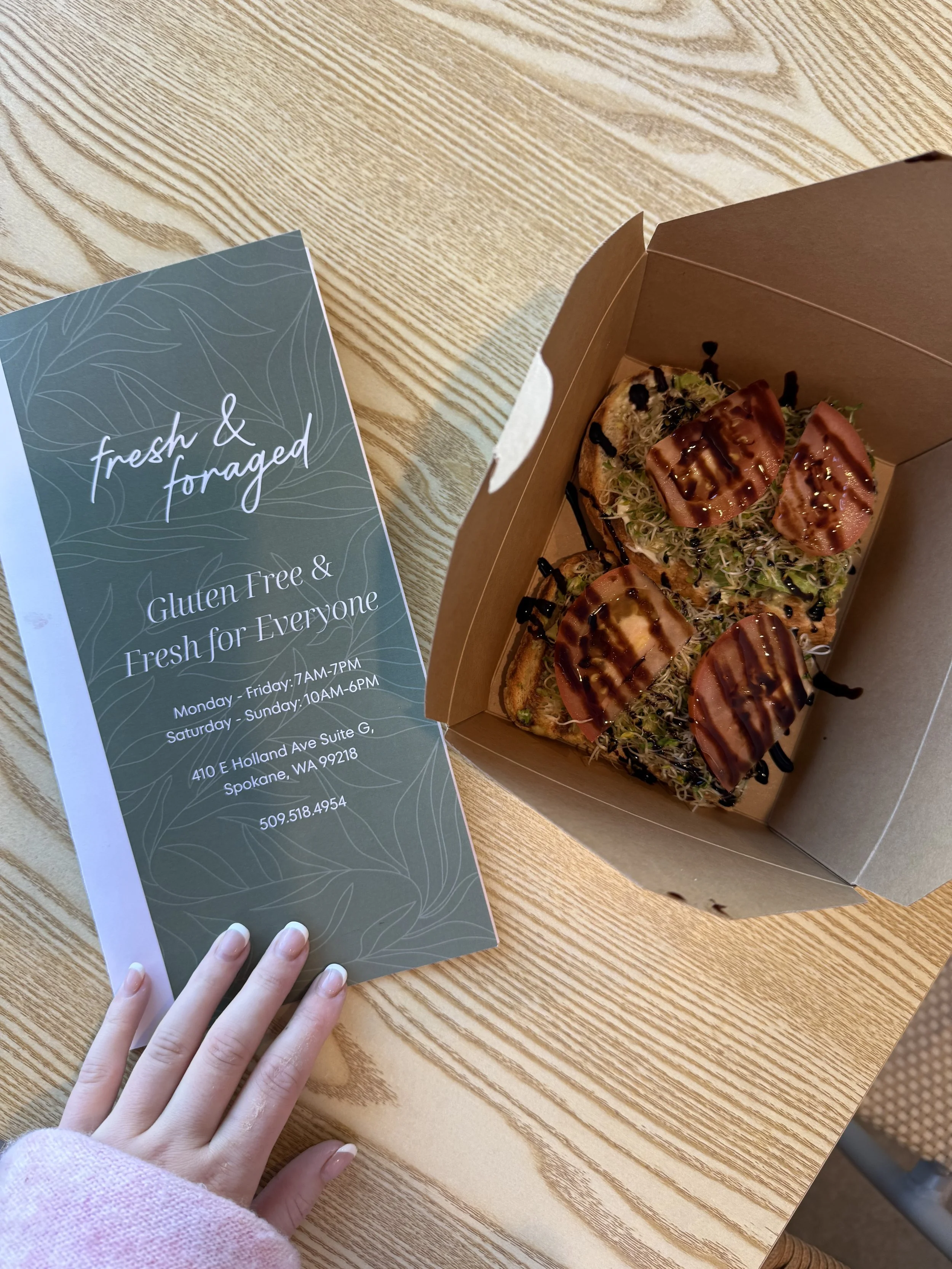
New Hand-Held Print Menus